在Python数据可视化中,seaborn较好的提供了图形的一些可视化功效。
seaborn官方文档见链接:http://seaborn.pydata.org/api.html
countplot是seaborn库中分类图的一种,作用是使用条形显示每个分箱器中的观察计数。接下来,对seaborn中的countplot方法进行详细的一个讲解,希望可以帮助到刚入门的同行。
导入seaborn库
import seaborn as sns
使用countplot
sns.countplot()
countplot方法中必须要x或者y参数,不然就报错。
官方给出的countplot方法及参数:
sns.countplot(x=None, y=None, hue=None, data=None, order=None, hue_order=None, orient=None, color=None, palette=None, saturation=0.75, dodge=True, ax=None, **kwargs)
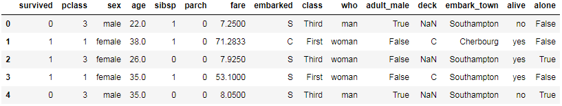
下面讲解countplot方法中的每一个参数。以泰坦尼克号为例。
原始数据如下:
sns.set(style=\'darkgrid\')
titanic = sns.load_dataset(\'titanic\')
titanic.head()
x, y, hue : names of variables in “data“ or vector data, optional. Inputs for plotting long-form data. See examples for interpretation.
第一种方式
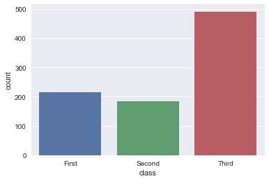
x: x轴上的条形图,以x标签划分统计个数
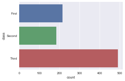
y: y轴上的条形图,以y标签划分统计个数
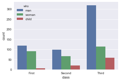
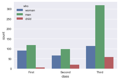
hue: 在x或y标签划分的同时,再以hue标签划分统计个数
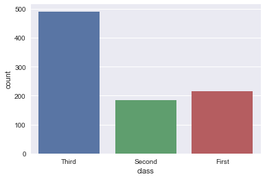
sns.countplot(x=\"class\", data=titanic)

sns.countplot(y=\"class\", data=titanic)

sns.countplot(x=\"class\", hue=\"who\", data=titanic)
第二种方法
x: x轴上的条形图,直接为series数据
y: y轴上的条形图,直接为series数据
sns.countplot(x=titanic[\'class\'])

sns.countplot(y=titanic[\'class\'])
data : DataFrame, array, or list of arrays, optional. Dataset for plotting.
If “x“ and “y“ are absent, this is interpreted as wide-form. Otherwise it is expected to be long-form.
data: DataFrame或array或array列表,用于绘图的数据集,x或y缺失时,data参数为数据集,同时x或y不可缺少,必须要有其中一个。
sns.countplot(x=\'class\', data=titanic)
order, hue_order : lists of strings, optional.Order to plot the categorical levels in, otherwise the levels are inferred from the data objects.
order, hue_order分别是对x或y的字段排序,hue的字段排序。排序的方式为列表。
sns.countplot(x=\'class\', data=titanic, order=[\'Third\', \'Second\', \'First\'])
sns.countplot(x=\'class\', hue=\'who\', data=titanic, hue_order=[\'woman\', \'man\', \'child\'])
orient : \”v\” | \”h\”, optional
Orientation of the plot (vertical or horizontal). This is usually
inferred from the dtype of the input variables, but can be used to
specify when the \”categorical\” variable is a numeric or when plotting
wide-form data.
强制定向,v:竖直方向;h:水平方向,具体实例未知。
color : matplotlib color, optional
Color for all of the elements, or seed for a gradient palette.
palette : palette name, list, or dict, optional.Colors to use for the different levels of the “hue“ variable.
Should be something that can be interpreted by :func:`color_palette`, or a dictionary mapping hue levels to matplotlib colors.
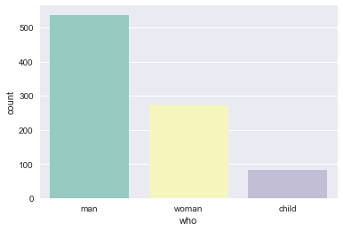
palette:使用不同的调色板
sns.countplot(x=\"who\", data=titanic, palette=\"Set3\")
ax : matplotlib Axes, optional
Axes object to draw the plot onto, otherwise uses the current Axes.
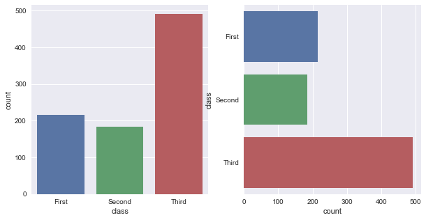
ax用来指定坐标系。
fig, ax = plt.subplots(1, 2, figsize=(10, 5))
sns.countplot(x=\'class\', data=titanic, ax=ax[0])
sns.countplot(y=\'class\', data=titanic, ax=ax[1])
到此这篇关于Python中seaborn库之countplot的数据可视化使用的文章就介绍到这了,更多相关Python seaborn库countplot内容请搜索自学编程网以前的文章或继续浏览下面的相关文章希望大家以后多多支持自学编程网!