一、前言
R语言不少库都可以方便的画dotplot,但是低频使用R这么多年,我依旧觉得R不是一门真正的编程语言。目前,在python中绘制dotplot貌似没有很轻量、方便的库,因此工作之余写了这个python_dotplot包,方便自己也希望能够方便他人吧。
二、安装
可以通过pypi快速安装:
pip install python_dotplot
该package当然可能存在一定的bug,所以也会处于不断迭代的过程中,可以通过以下方式获得特定或最新版本
pip install python_dotplot --upgrade
pip install python_dotplot==0.0.1b1
如果通过--upgrade参数不能获得最新版本,国内镜像会有一定的延迟,可指定pypi官方源指定镜像:
pip install -i https://pypi.python.org/pypi python_dotplot
三、模块导入
import dotplot
import dotplot.utils
import pandas as pd

%config InlineBackend.figure_format = \'retina\'  # 如果你的电脑设备是视网膜屏,可指定该参数渲染jupyter图像,会超清晰,超好看
包的层级结构很简单,主要包括以下模块:
dotplot
├── cmap.py # 自定义color map
├── core.py # 实现了Dotplot类,用于封装数据以及绘图
├── hierarchical.py # 实现了层次聚类,用于支持dotplot行和列通过层次聚类进行自动排序
├── __init__.py # 初始化模块
└── utils.py # 实用函数,目前是夹带私货,我自己用的预处理函数,也许对其他人也有用
四、数据准备
我们首先需要准备一个数据,这里要求输入必须是一个tidy data格式的pandas Dataframe,简而言之,tidy data是指在该数据框中每一行是一个观测,每一列是一个属性,下面以示例数据为例:
term_list = [\'GO:0002455\', \'GO:0006958\', \'GO:0006956\', \'GO:0038096\',\'GO:0002673\',
             \'GO:0051251\', \'GO:0060333\', \'GO:0006910\',\'GO:0002483\', \'GO:0002440\',
             \'GO:0009141\', \'GO:0009123\', \'GO:0006119\', \'GO:0009260\', \'GO:0015985\', \'GO:0015986\', \'GO:0006260\',
            \'GO:0044843\', \'GO:0061621\', \'GO:0061718\']

up = pd.read_csv(\'./example_data/group1.csv\', header=0, index_col=0)
down = pd.read_csv(\'./example_data/group2.csv\', header=0, index_col=0)

data = dotplot.utils.merge_clusterprofile_results(dataframes=(up, down), groups=[\'B6_up\', \'B6_down\'], term_list=term_list)
data.head()
| Description | GeneRatio | BgRatio | pvalue | p.adjust | qvalue | geneID | Count | group | |
| ID | |||||||||
| GO:0002455 | humoral immune response mediated by circulatin… | 22/178 | 150/18670 | 19.365993 | 16.222197 | 16.298589 | HLA-DQB1/CD55/IGHM/PTPRC/TRBC2/IGHG2/IGKV3-20/… | 22 | B6_up |
| GO:0006958 | complement activation, classical pathway | 20/178 | 137/18670 | 17.588789 | 14.989062 | 15.065454 | CD55/IGHM/TRBC2/IGHG2/IGKV3-20/IGHV4-34/IGHV3-… | 20 | B6_up |
| GO:0006956 | complement activation | 20/178 | 175/18670 | 15.453684 | 13.008859 | 13.085251 | CD55/IGHM/TRBC2/IGHG2/IGKV3-20/IGHV4-34/IGHV3-… | 20 | B6_up |
| GO:0038096 | Fc-gamma receptor signaling pathway involved i… | 18/178 | 139/18670 | 14.916693 | 12.675988 | 12.752379 | PTPRC/LYN/IGHG2/IGKV3-20/IGHV4-34/IGHV3-30/IGL… | 18 | B6_up |
| GO:0002673 | regulation of acute inflammatory response | 18/178 | 159/18670 | 13.871614 | 11.817674 | 11.894066 | HLA-E/CD55/IGHG2/IGKV3-20/IGHV4-34/IGHV3-30/IG… | 18 | B6_up |
五、画图
首先我们可以借助 DotPlot的类方法parse_from_tidy_data 对数据进行封装,然后直接调用plot函数进行绘图。当然,你也可以通过DotPlot的构造函数__init__()来实例化DotPlot对象。
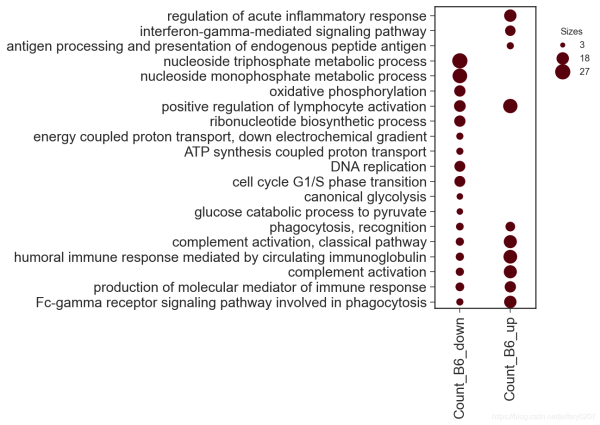
- 一维数据展示
new_keys = {\'item_key\': \'Description\',\'group_key\': \'group\',\'sizes_key\': \'Count\'}
dp = dotplot.DotPlot.parse_from_tidy_data(data, **new_keys)
sct = dp.plot(size_factor=10, cmap=\'Reds\')  # 通过size_factor 调节图中点的大小
dp = dotplot.DotPlot.parse_from_tidy_data(data, item_key=\'Description\', group_key=\'group\', sizes_key=\'Count\')  # 该效果完全同上,这是python语言特性
sct = dp.plot(size_factor=10, cmap=\'Reds\')

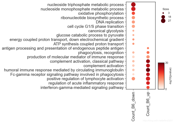
- 二维数据展示
我们可以通过color_key指定data中的列做颜色映射。
new_keys = {\'item_key\': \'Description\',\'group_key\': \'group\',\'sizes_key\': \'Count\',\'color_key\': \'pvalue\'}
dp = dotplot.DotPlot.parse_from_tidy_data(data, **new_keys)
sct = dp.plot(size_factor=10, cmap=\'Reds\', cluster_row=True)
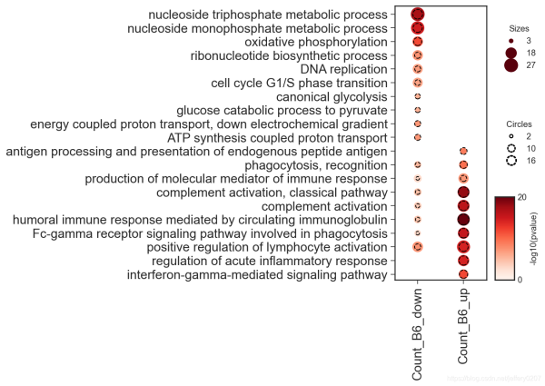
- 三维数据展示
可以通过circle_key增加一列作为虚线圆圈的映射。
DEFAULT_CLUSTERPROFILE_KEYS = {
    \'item_key\': \'Description\', \'group_key\': \'group\',
    \'sizes_key\': \'Count\', \'color_key\': \'pvalue\',
    \'circle_key\': \'qvalue\'
}
dp = dotplot.DotPlot.parse_from_tidy_data(data, **DEFAULT_CLUSTERPROFILE_KEYS)
sct = dp.plot(size_factor=10, cmap=\'Reds\', cluster_row=True)
当然,更多的参数我们可以通过signature来查看,我对这些参数都做了类型注释,应该是通俗易懂的:
?dp.plot
Signature:
dp.plot(
    size_factor:float=15,
    vmin:float=0,
    vmax:float=None,
    path:Union[os.PathLike, NoneType]=None,
    cmap:Union[str, matplotlib.colors.Colormap]=\'Reds\',
    cluster_row:bool=False,
    cluster_col:bool=False,
    cluster_kws:Union[Dict, NoneType]=None,
    **kwargs,
)
Docstring:
:param size_factor: `size factor` * `value` for the actually representation of scatter size in the final figure
:param vmin: `vmin` in `matplotlib.pyplot.scatter`
:param vmax: `vmax` in `matplotlib.pyplot.scatter`
:param path: path to save the figure
:param cmap: color map supported by matplotlib
:param kwargs: dot_title, circle_title, colorbar_title, dot_color, circle_color
            other kwargs are passed to `matplotlib.Axes.scatter`
:param cluster_row, whether to cluster the row
:param cluster_col, whether to cluster the col
:param cluster_kws, key args for cluster, including `cluster_method`, `cluster_metric`, \'cluster_n\'
:return:
因此,我们可以通过关键字参数修改图例中的部分组件:
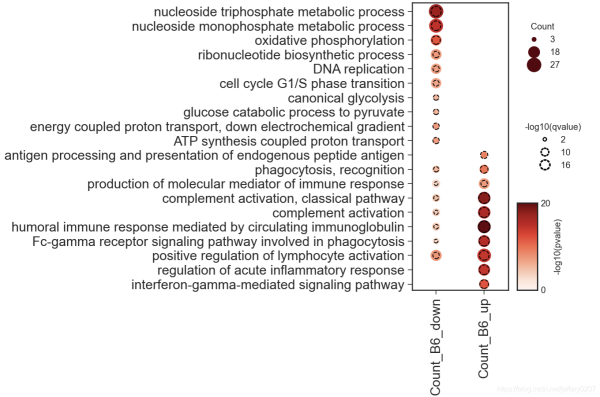
sct = dp.plot(size_factor=10, cmap=\'Reds\', cluster_row=True,
dot_title = \'Count\', circle_title=\'-log10(qvalue)\',
colorbar_title = \'-log10(pvalue)\')
六、写在篇末
dotplot在数据可视化中是一个强有力的展示方式,选择一个合适的可视化方式胜过千言万语
最后,最适合的可视化方式是最直观、最简洁的,不是炫技,别被花里胡哨的可视化所迷住双眼而忽略了信息的传达。
到此这篇关于教你怎么用python绘制dotplot的文章就介绍到这了,更多相关python绘制dotplot内容请搜索自学编程网以前的文章或继续浏览下面的相关文章希望大家以后多多支持自学编程网!