我就废话不多说了,还是直接看代码吧!
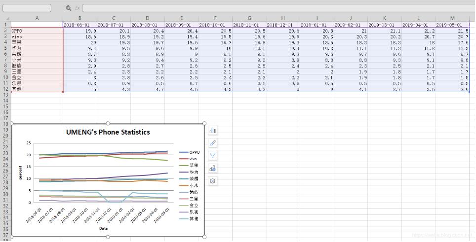
import os
import openpyxl

from datetime import date
from openpyxl import Workbook

from openpyxl.chart import (
 Series,
 LineChart,
 Reference,
)
def add_line_chart(title, wss, min_col, min_row, max_col, max_row):
 c1 = LineChart()
 c1.title = title # 图的标题
 c1.style = 12 # 线条的style
 c1.y_axis.title = \'percent\' # y坐标的标题
 if \'IDC\' not in title:
  c1.x_axis.number_format = \'d-mmm\' # 规定日期格式 这是月,年格式
  c1.x_axis.majorTimeUnit = \"Months\" # 规定日期间隔 注意days;Months大写
 c1.x_axis.title = \"Date\" # x坐标的标题
 data = Reference(wss, min_col=min_col, min_row=min_row, max_col=max_col, max_row=max_row) # 图像的数据 起始行、起始列、终止行、终止列
 c1.add_data(data, titles_from_data=True, from_rows=True)
 dates = Reference(wss, min_col=2, min_row=1, max_col=max_col)
 c1.set_categories(dates)
 wss.add_chart(c1, \"A6\") # 将图表添加到 sheet中


def save_data_to_excel(file_name, target_sheet_name):
 select_cursor = connect.cursor()
 select_sql = \"select phone_company, record_date, record_percent from phone_statistics where record_company = \'%s\'\" % target_sheet_name
 if target_sheet_name == \"IDC\":
  select_sql = \"select phone_company, record_q, record_percent from phone_statistics where record_company = \'%s\'\" % target_sheet_name
 select_cursor.execute(select_sql, ())

 data_dic = {}
 all_date = {}
 all_phone_company = {}
 for item in select_cursor:
  if target_sheet_name == \"IDC\":
   data_dic[item[0] + \'_\' + item[1]] = item[2]
  else:
   if type(item[1]) == str:
    data_dic[item[0] + \'_\' + item[1]] = item[2]
   else:
    data_dic[item[0] + \'_\' + item[1].strftime(\"%Y-%m-%d\")] = item[2]
  all_date[item[1]] = 1
  all_phone_company[item[0]] = 1

 if os.path.exists(file_name):
  wb = openpyxl.load_workbook(file_name)
 else:
  wb = Workbook()

 try:
  wb.remove_sheet(wb[\'Sheet\'])
 except Exception as e:
  pass
 try:
  wb.remove_sheet(wb[target_sheet_name])
 except Exception as e:
  pass

 try:
  sheet = wb[target_sheet_name]
 except Exception as e:
  sheet = wb.create_sheet()

 start_date_index = \'B\'
 for each_date in all_date.keys():

  if target_sheet_name == \"IDC\":
   sheet[\'%s1\' % start_date_index] = each_date
  else:
   if type(each_date) == str:
    sheet[\'%s1\' % start_date_index] = each_date
   else:
    sheet[\'%s1\' % start_date_index] = each_date.strftime(\"%Y-%m-%d\")
  start_date_index = chr(ord(start_date_index) + 1)

 start_name_index = 2
 for each_name in all_phone_company.keys():
  sheet[\'A%d\' % start_name_index] = each_name
  start_name_index += 1

 start_date_index = \'B\'
 start_name_index = 2
 for each_date in all_date.keys():
  for each_name in all_phone_company.keys():

   if target_sheet_name == \"IDC\":
    key = each_name + \'_\' + each_date
    if key in data_dic:
     sheet[\'%s%d\' % (start_date_index, start_name_index)] = data_dic[key]
   else:
    if type(each_date) == str:
     key = each_name + \'_\' + each_date
    else:
     key = each_name + \'_\' + each_date.strftime(\"%Y-%m-%d\")
    if key in data_dic:
     sheet[\'%s%d\' % (start_date_index, start_name_index)] = data_dic[key]
   start_name_index += 1
  start_date_index = chr(ord(start_date_index) + 1)
  start_name_index = 2

 sheet.title = target_sheet_name
 sheet.column_dimensions[\'A\'].width = 20
 start_date_index = \'B\'
 for each_date in all_date.keys():
  sheet.column_dimensions[start_date_index].width = 13
  start_date_index = chr(ord(start_date_index) + 1)

 add_line_chart(target_sheet_name.upper() + \"\'s Phone Statistics\", sheet, 1, 2, len(all_date.keys()) + 1,
     min(15, len(all_phone_company.keys()) + 1))

 wb.save(file_name)
 pass
补充知识:python plotly line chart 折线图
我就废话不多说了,还是直接看代码吧!
# 1 折线图数据
# trace1 - 基本格式
# trace2 - 更多参数
trace1 = go.Scatter(
 x = x1,
 y = y2,
)
trace2 = go.Scatter(
 x = x2,
 y = y2,
 mode = \'lines\', # 模式:lines 线,markers 点。可用“+”相连
 name = \'line2\', # 折线名,显示于图例
 connectgaps = True # 连接缺失点两端 默认False
 line = dict(
  color = (\'rgb(205, 12, 24)\'), # 颜色
  width = 4, #线宽
  dash = \'dash\') # 虚线: dash 一一,dot ···,dashdot 一·一
)
)

# 2 打包数据
data = [trace1,trace2]

# 3 格式
layout = dict(title = \'折线\',
    xaxis = dict(title = \'时间\'), # 横轴坐标
    yaxis = dict(title = \'数量\'), # 总轴坐标
    legend=dict(x=1.1,y=1) # 图例位置
    )

# 4 打包数据+格式
fig = dict(data=data, layout=layout)

# 5 画图
py.iplot(fig, filename=\'styled-line\')
以上这篇Python openpyxl 插入折线图实例就是小编分享给大家的全部内容了,希望能给大家一个参考,也希望大家多多支持自学编程网。