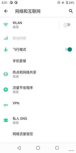
Android开发中难免会遇到参数配置的功能,此时可以通过普通的布局实现,不过android sdk中也为我们提供了Preferences,可以通过配置xml方式实现配置界面的效果。比如手机系统的设置应用就是使用的Preferences:
如何使用Preferences这里就不说了,你可以新建Activity选择Settings Activity模板了解它的基本使用,模板默认的界面如下:
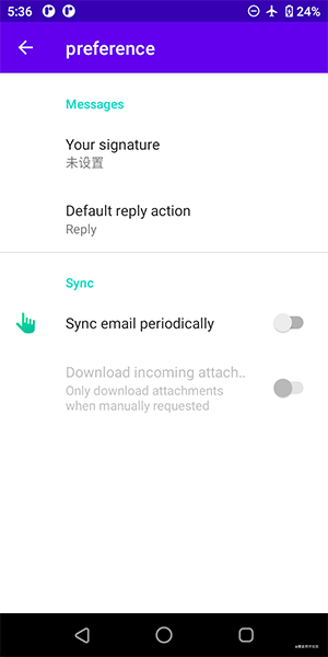
可以看到,非常丑,这里就以修改icon和文字的间距为目标探究如何修改Preferences样式。
1,查找源码
以SwitchPreferenceCompat为例,查看其源代码
首先查看其构造方法:
public class SwitchPreferenceCompat extends TwoStatePreference {

    /**
     * Construct a new SwitchPreference with the given style options.
     *
     * @param context      The {@link Context} that will style this preference
     * @param attrs        Style attributes that differ from the default
     * @param defStyleAttr An attribute in the current theme that contains a reference to a style
     *                     resource that supplies default values for the view. Can be 0 to not
     *                     look for defaults.
     * @param defStyleRes  A resource identifier of a style resource that supplies default values
     *                     for the view, used only if defStyleAttr is 0 or can not be found in the
     *                     theme. Can be 0 to not look for defaults.
     */
    public SwitchPreferenceCompat(Context context, AttributeSet attrs, int defStyleAttr,
            int defStyleRes) {
        super(context, attrs, defStyleAttr, defStyleRes);
		...
    }

    public SwitchPreferenceCompat(Context context, AttributeSet attrs, int defStyleAttr) {
        this(context, attrs, defStyleAttr, 0);
    }

    public SwitchPreferenceCompat(Context context, AttributeSet attrs) {
        // 使用R.attr.switchPreferenceCompatStyle作为默认主题样式
        this(context, attrs, R.attr.switchPreferenceCompatStyle);
    }

    public SwitchPreferenceCompat(Context context) {
        this(context, null);
    }
    ...
}
SwitchPreferenceCompat重写了四个构造方法,其中在两参数的构造方法中传入了默认的主题样式R.attr.switchPreferenceCompatStyle, 这就是一个自定义的属性,定义在values-values.xml中。那么这个属性是在哪里赋值的呢,查找一下,它在switchPreferenceCompatStyle中赋了值:
<style name=\"PreferenceThemeOverlay\">
		...
        <item name=\"switchPreferenceCompatStyle\">@style/Preference.SwitchPreferenceCompat.Material</item>
        ...
    </style>
继续查看Preference.SwitchPreferenceCompat.Material
<style name=\"Preference.SwitchPreferenceCompat.Material\">
        <item name=\"android:layout\">@layout/preference_material</item>
        <item name=\"allowDividerAbove\">false</item>
        <item name=\"allowDividerBelow\">true</item>
        <item name=\"iconSpaceReserved\">@bool/config_materialPreferenceIconSpaceReserved</item>
    </style>
此处设置了android:layout属性,查看该layout:
<!-- preference_material.xml -->
<?xml version=\"1.0\" encoding=\"utf-8\"?>
<LinearLayout
    xmlns:android=\"http://schemas.android.com/apk/res/android\"
    android:layout_width=\"match_parent\"
    android:layout_height=\"wrap_content\"
    android:minHeight=\"?android:attr/listPreferredItemHeightSmall\"
    android:gravity=\"center_vertical\"
    android:paddingLeft=\"?android:attr/listPreferredItemPaddingLeft\"
    android:paddingStart=\"?android:attr/listPreferredItemPaddingStart\"
    android:paddingRight=\"?android:attr/listPreferredItemPaddingRight\"
    android:paddingEnd=\"?android:attr/listPreferredItemPaddingEnd\"
    android:background=\"?android:attr/selectableItemBackground\"
    android:clipToPadding=\"false\"
    android:baselineAligned=\"false\">

    <include layout=\"@layout/image_frame\"/>

    <RelativeLayout
        android:layout_width=\"0dp\"
        android:layout_height=\"wrap_content\"
        android:layout_weight=\"1\"
        android:paddingTop=\"16dp\"
        android:paddingBottom=\"16dp\">

        <TextView
            android:id=\"@android:id/title\"
            android:layout_width=\"wrap_content\"
            android:layout_height=\"wrap_content\"
            android:singleLine=\"true\"
            android:textAppearance=\"?android:attr/textAppearanceListItem\"
            android:ellipsize=\"marquee\"/>

        <TextView
            android:id=\"@android:id/summary\"
            android:layout_width=\"wrap_content\"
            android:layout_height=\"wrap_content\"
            android:layout_below=\"@android:id/title\"
            android:layout_alignLeft=\"@android:id/title\"
            android:layout_alignStart=\"@android:id/title\"
            android:layout_gravity=\"start\"
            android:textAlignment=\"viewStart\"
            android:textColor=\"?android:attr/textColorSecondary\"
            android:maxLines=\"10\"
            style=\"@style/PreferenceSummaryTextStyle\"/>

    </RelativeLayout>

    <!-- Preference should place its actual preference widget here. -->
    <LinearLayout
        android:id=\"@android:id/widget_frame\"
        android:layout_width=\"wrap_content\"
        android:layout_height=\"match_parent\"
        android:gravity=\"end|center_vertical\"
        android:paddingLeft=\"16dp\"
        android:paddingStart=\"16dp\"
        android:paddingRight=\"0dp\"
        android:paddingEnd=\"0dp\"
        android:orientation=\"vertical\"/>

</LinearLayout>
image_frame.xml
<LinearLayout
    xmlns:android=\"http://schemas.android.com/apk/res/android\"
    xmlns:app=\"http://schemas.android.com/apk/res-auto\"
    android:id=\"@+id/icon_frame\"
    android:layout_width=\"wrap_content\"
    android:layout_height=\"wrap_content\"
    android:minWidth=\"56dp\"
    android:gravity=\"start|center_vertical\"
    android:orientation=\"horizontal\"
    android:paddingLeft=\"0dp\"
    android:paddingStart=\"0dp\"
    android:paddingRight=\"8dp\"
    android:paddingEnd=\"8dp\"
    android:paddingTop=\"4dp\"
    android:paddingBottom=\"4dp\">

    <androidx.preference.internal.PreferenceImageView
        android:id=\"@android:id/icon\"
        android:layout_width=\"wrap_content\"
        android:layout_height=\"wrap_content\"
        app:maxWidth=\"48dp\"
        app:maxHeight=\"48dp\"/>

</LinearLayout>
看到这里不禁:臣卜木曹!这不就是每个item的layout吗?布局是找到了,那怎么修改呢?
2,覆盖源码
源码虽然不能修改,但是可以覆盖。
于是复制一份preference_material.xml和image_frame.xml,到你的layout目录下,然后修改image_frame.xml中的minWidth属性为40dp,在运行一下:

可以看到,生效了。
分析一下preference_material.xml可知每个item主要有三部分,如下:
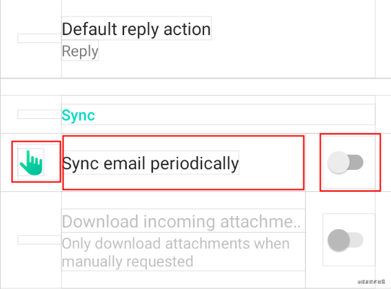
第一部分为图标区域,第二部分是title和summary区域,第三部分是其他控件区域。
了解了其大体结构,就可以根据需求进行修改了。
注意:第三部分控件是动态添加的,修改时还需要查找一下其具体实现。
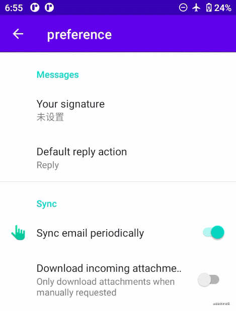
比如要修改上图中的switch button,就要先找到它的布局,查找源码可知它使用的是preference_widget_switch_compat.xml或preference_widget_switch.xml,之所以有两个是为了做兼容。那么接下来只需要覆盖这两个xml文件,并修改switch样式即可。效果如下:

到这里自定义Preferences样式已经完了,下面介绍的是通用的效果,不仅可以用在Preferences, 也可以用于其他使用水波涟漪效果的场景。
3,点击水波效果
Preferences默认每个item是有点击的水波特效的,它是通过android:background=\"?android:attr/selectableItemBackground\"属性实现。
按说已经很炫酷了,但是遇到事儿多的产品经理非要你改个水波颜色怎么搞?
可以通过自定义Ripple实现,不过还有更简单的方式,就是重写android:colorControlHighlight属性,如下:
<item name=\"android:colorControlHighlight\">@color/color_item_high_light</item>
效果如下:
此时产品经理又来了 \”你这个实现起来貌似很简单,那你给点击时的高亮区域加个边距并设置成圆角吧\”。
一万头羊驼奔腾而过!!!
此时就避免不了自定义Ripple了。
新建ripple标签的drawable,并设置颜色即可实现自定义Ripple:
<?xml version=\"1.0\" encoding=\"utf-8\"?>
<ripple xmlns:android=\"http://schemas.android.com/apk/res/android\"
    android:color=\"@color/teal_700\">

</ripple>
然后通过item设置边距以及圆角,完成代码:
<?xml version=\"1.0\" encoding=\"utf-8\"?>
<ripple xmlns:android=\"http://schemas.android.com/apk/res/android\"
    android:color=\"@color/teal_700\">
    <item
        android:left=\"8dp\"
        android:right=\"8dp\">
        <shape android:shape=\"rectangle\">
            <solid android:color=\"?android:attr/colorBackground\" />
            <corners android:radius=\"6dp\" />
        </shape>
    </item>
</ripple>
运行效果如下:

以上就是Android 修改Preferences默认样式的步骤的详细内容,更多关于Android 修改Preferences默认样式的资料请关注自学编程网其它相关文章!


